10
AprGetting started with Angular Material
Angular Material is simply a group of design components used by Angular. By using these material design components, we can easily integrate material design into our Angular application. Using angular material design components, we can design components for both mobile and web versions.
Angular Material is a popular UI component library for Angular developers because angular Material provides modern UI components that work across mobile, web, and desktop that follows Google's material component specifications.
Angular Materials facilitate the development process by following the reusability of the various common and frequently used components such as Cards, form Inputs, data tables along with pagination, expansion panels, and so on. The angular Material themes could be a specification for the unified system of visual, motion, and interactive designs that adapts across different devices and different screen sizes accordingly. It is quite recommended because it is faster, more UI/UX friendly, and more responsive websites across multiple devices.
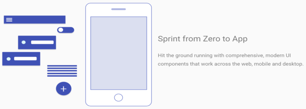
Recently angular 13 is released, and with that Angular material, dependencies are already installed when we use @angular/cli.
Advantages of using Angular Material
Cross-platform user interface components, so that it can work on Web, Mobile, and desktop apps without any separate configuration for each of them
By using the material design components, we can have the better user interface experience
We can achieve high responsiveness of the layout by providing a different attribute to the elements as per our project requirements
Easy to use syntax so that we can easily integrate the angular material components into our angular application to enhance the development duration
Multiple layout options are available so that we can choose any of the available themes and integrate them into our angular application
The angular material has a collection of more than 50 components so that we can use any of the components inside our application according to the usage
Error log support makes it completely suitable for any scale of an application if we emit any attribute then it logs error into the console, isn’t it great
Who uses Angular Material?
The angular material is a product by Google, so Google itself uses material design components.
Gmail
YouTube
Google Cloud
And many more websites used angular material design components, even angular material docs also used material design.
Components in Angular Material
In Angular Material, primarily there are 6 types of components are available which are listed below.
Form Control
Used to integrate different form controls which are used with a form like Textbox, Checkbox, Radio button, select box, date picker, textarea, etc.
Navigation
Navigation controls are used to provide a facility to users to navigate from one page to another, there are three components are available in the navigation
Menu
Sidenav
Toolbar
Layout
Layout controls are used to construct pages in a distributed way, there are many components are available which are listed below. Card,divider,list,stepper,tabs etc.
Buttons
Different buttons controls are also available to use the button as per requirements like toggle button, as a spinner, progress bars, icon, etc.
Modals
Modals are the most used component which provides facility to provide dialog service to show some static information to the end-user and there may be another purpose for what you can use modal controls, here in the angular material we have many modal controls like Dialog, Snack bar, Bottom sheet, tooltip, etc.
Data Table
The data table is also one of the most used components which are used to show the list of records, filter it, search specific records, paginate the list of records, etc. Angular material provides the number of data table controls.
Table
Paginator
Sort Header
So this is the list of components provided by Angular material, next question may arise that how to integrate angular material in the angular app, so let’s learn the step by steps procedure for the same.
How to Integrate Angular Material
With the release of the previous version of Angular 6, the new command is available called "ng" instead of "npm", by using the ng command we can easily install all the necessary dependencies and scripts as well. To install angular material dependency into our angular app we can use the below ng command.
ng add @angular/material
If you are using an older version of Angular then you can use the below command to install the angular material.
npm install –save @angular/material @angular/animations @angular/cdk
If you are using yarn instead of npm then use the below command.
yarn install –save @angular/material @angular/animations @angular/cdk
After installing angular material dependency using the above command, now we can use any of the material components in our angular application.
What’s New in Angular Material?
With the release of Angular 6, one of the new elements is added into Angular Material which is called Angular Material Starter Component. Starter Components are the component in which a collection of material components are included, and will create a specific layout to get started quickly with material components.
But with the recently released version of Angular, we have some new and featured components available to be integrated which are given below.
- Datepicker: To work with the dates related to operations
- Slide toggle: To work with the toggle feature i.e. on/off feature
- Sliders: To work with the slider to determine the value of various operations such as brightness, volume, etc
These components can be an entry point of any quick single-page application after that we can make further changes to the pre-defined structure. Primarily there are three starter components added which are listed below.
Material Sidenav
Material Dashboard
Material Datatable
By using those starter components we can have pre-configured functionality, to generate specific starter components we can use given ng commands respectively.
Material Sidenav
Material Sidenav provides a complete navigation bar at the right portion of the screen and also provides a toolbar with it. To generate sidenav, we can use the below ng command
ng generate @angular/material:materialNav –name <Any_Name>
Material Dashboard
The material dashboard is a collection of products that provides a dashboard kind of layout by just using the below ng command.
ng generate @angular/material:materialDashboard –name <Any_Name>
Material Datatable
The material data table consists of a material table, using this table we can have many inbuilt functionalities to make the table multipurpose. It supports various operations like paging, searching, filtering, etc. To generate a material data table, just use the below ng command.
ng generate @angular/material:materialTable –name <Any_Name>
So these are the starter components we have covered recently, but what about other controls, now we are going to see that how to integrate any material components into our application. We are going to learn one component which is a toolbar, let’s follow the steps. Previously we have installed an angular-material dependency, now open the app.module.ts file and here we will import important toolbar dependencies.
App.module.ts
 import { BrowserModule } from '@angular/platform-browser';
 import { NgModule } from '@angular/core';
 import { MatToolbarModule, MatToolbar } from '@angular/material';
 import { AppComponent } from './app.component';

 @NgModule({
 declarations: [
 AppComponent
 ],
 imports: [
 BrowserModule,
 MatToolbarModule,
 ],
 providers: [],
 bootstrap: [AppComponent]
 })
 export class AppModule { }
To use a markup of a toolbar component we need to use the below markup tag into our HTML file as described below.
<mat-toolbar color="accent">
 <span>Angular Material - Toolbar </span>
 </mat-toolbar>
And for styling toolbar element and theming, we need to import its style sheet file; we just need to import a single line into the styles.css file.
@import '~@angular/material/prebuilt-themes/deeppurple-amber.css';
Now to see what our material toolbar component looks like, we need to run our angular app, and you will get output like the below screen.
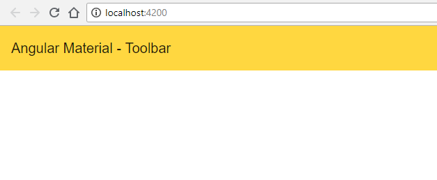
This is the simple example in which we have covered that how to install angular material, import dependencies, use markup in HTML and run the example.
Summary
Angular Material is a popular UI component library for Angular and its components can help in constructing highly attractive, responsive, with recommended UI/UX feedback, and functional web pages and web applications while keeping in mind the need for modern web design principles like browser compatibility, device independence, better end-user usabilities, and feedback. ultimately Angular Material helps us to create eye-catching, effective, and robust UI behavior across the user interactivity session that is completely inspired by Google Material Design.
In this article getting started with the angular material, we have covered a few important topics about material components. In upcoming articles, we will explore more angular material components in a very depth manner.
Take our Angularmaterial skill challenge to evaluate yourself!
In less than 5 minutes, with our skill challenge, you can identify your knowledge gaps and strengths in a given skill.




 LEAD-ACE: EdTech Platform