


25
JunData Visualization in Data Science
02 Aug 2025
Beginner
3.71K Views
9 min read

Learn with an interactive course and practical hands-on labs
Data Science with Python Certification Course
Introduction
Data visualization has developed into an essential tool for businesses to extract insights from their data in today's era of data-driven decision-making. As a data scientist, I have personally experienced how data science tutorial can turn data from merely being a collection of numbers and statistics into actionable insights that may boost business success. The Importance of Data Visualization in Data Science Online Training, various types of data visualization in data science, data visualization techniques in data science, tools for data visualization, and best practices for producing good data visualizations will all be covered in this article.
What is Data Visualization
The graphic depiction of data and information is known as data visualization. It involves converting difficult-to-understand facts into an understandable visual representation. Charts, graphs, maps, and various other visualizations are examples of this. We can discover relationships, trends, and patterns in data that may be challenging to identify from raw data alone thanks to data visualization.
Importance of Data Visualization in Data Science
Data visualization is the graphical representation of data. It is a powerful tool for communicating complex information in a way that is easy to understand. The importance of data visualization in data science is as follows::
- In data science, data visualization is essential for effectively communicating complicated information.
- It streamlines information, makes it simple to comprehend, and supports decision-making.
- Visualisations make it easier to spot trends and outliers as well as quickly reach data-driven conclusions.
- They help to spot mistakes and guarantee data quality.
- Data visualization helps in presenting findings to stakeholders so they can comprehend conclusions and take relevant action.
Read More - Top Data Science Interview Questions
Types of Data Visualization in Data Science
A useful tool for understanding and presenting complex data in a way that is understandable to a wide range of people is data visualization. Data scientists can successfully depict data using a wide variety of types of data visualization in Data Science, such as:
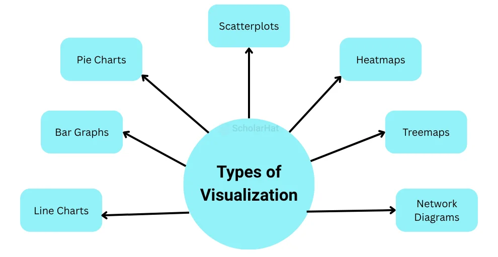
- Line charts: Line charts are used to display trends across time.
- Bar graphs: Using bar graphs to compare values between categories.
- Pie charts: Pie charts are applied to illustrate how a whole is broken into various portions. They are frequently employed to express percentages or ratios.
- Scatterplots: Useful for displaying the relationship between two variables is the scatter plot..
- Heatmaps: In a matrix format, heatmaps are utilized to display vast amounts of data. They are frequently employed in data science to, for instance, represent data on gene expression.
- Treemaps: Heat maps are used to depict how data is distributed over a two-dimensional space.
- Network diagrams: Useful for displaying connections between nodes in networks
Data visualization concepts and strategies
When producing powerful data visualizations, it's vital to keep a few essential ideas and techniques in mind. These consist of:
- Keep things simple: Avoid needless and cluttered features that could take attention away from the main point.
- Select the appropriate visualization style: Choose a visualization that most accurately conveys the information and the idea you want to get across.
- Effective use of color: Use color to draw attention to crucial information, but be careful not to overdo it.
- Label everything clearly: To ensure that the audience can understand the data being presented, make sure all labels and axes are appropriately labeled.
- Tell a story: Tell a story and deliver a message through visualization.
Data Visualization Process/Workflow
The workflow for data visualization in data science is a methodical process that helps to guarantee that data visualizations are accurate, efficient, and interesting. The following steps are often included in this process:
- Data preparation: Preparing information is the starting point in the data visualization process. The data must be gathered and cleaned in order for visualization to be possible. This could entail eliminating duplicates, adding missing numbers, or changing the format of the data. This step is essential since improperly processed data can result in misleading or incorrect visualizations.
- Determine the goal: The visualization's goal must be determined in the second phase. Understanding your audience and the insights you wish to convey are necessary for this. Understanding the visualization's goal can help you select the best form of visualization to successfully convey your thoughts.
- Pick the appropriate visualization: After determining the visualization's goal, you can pick the best form of visualization to properly convey your thoughts. Determine the best manner to portray the data, this may entail testing with various diagrams, graphs, and maps.
- Design the visualization: When designing a visualization, it is important to keep clarity and readability in mind when choosing colors, labels, and various other visual components. Making sure the visualization is attractive and interesting is another aspect of it. The visualization's design plays a crucial role in the process because it has a big impact on how effective the visualization is.
- Implement the visualization: A language for programming or visualization software must be used to carry out the visualization after it has been designed. The visualization may then be produced using programs like Python, R, or Tableau. It is crucial to check that the visualization accurately depicts the data as well as conveys insights throughout the implementation phase.
- Test and improve: To make sure the visualization is reliable and efficient, it is crucial to test and improve it. This could entail asking stakeholders for input or conducting A/B testing to evaluate several visualizations and identify the most successful one. The testing and improvement stage is essential since it guarantees the visualization's accuracy, potency, and interest.
Tools for Data Visualization
For data visualization, there are numerous options for tools and methods. Among the most widely used tools for Data Visualization & data visualization techniques in data science & Software for Data Visualization are:
- Tableau: Tableau is a potent data visualization application that enables users to build interactive dashboards and visualizations.
- R: A computer language that's frequently used for data visualization and data science’s statistical analysis.
- Python: Python is a flexible programming language that, among other things, may be used for data visualization.
- Excel: Excel is a fundamental tool for making simple visualizations.
Additionally, other methods can be used to produce powerful visualizations. These consist of:
- Data cleaning: Before developing visualizations, data should be cleaned to ensure accuracy and consistency.
- Data aggregation: Data aggregation is the process of combining data pieces to produce more insightful visualizations.
- Data scaling: Data scaling is the process of changing data values to make comparisons simpler.
The data visualization process/workflow
There are usually numerous processes involved in the data visualization process. These consist of:
- Describe the issue: Determine the query you're attempting to address or the point you're attempting to make.
- Collect the data: Gather and purify the information you need to respond.
- Deciding on a visualization: Choose the visualization style that most accurately conveys the facts & the message you want to get across.
- Make the visualization: Create the visualization with the tool of your choice.
- Evaluation of the visualization: Uses the visualization to communicate the message or provide an answer to the query.
- Report the findings: Involve stakeholders in the presentation of the visualization and the conclusions drawn from it.
Common mistakes to avoid when creating data visualizations
When producing data visualizations, people frequently commit many errors. These consist of:
- Using an inappropriate data visualization technique.
- Adding extraneous components to the visualization makes it too complicated.
- Using labels that are confusing or deceptive.
- Failing to convey the message.
Best practices for data visualization in data science
It's important to adhere to best practices while developing data visualizations in data science:
- Recognize your target audience and make your visualizations suited to their requirements.
- Keep visualizations clear and uncluttered, concentrating on communicating the main points.
- Select the sort of chart or graph that best illustrates the data and corroborates the conclusions you wish to emphasize.
- Make that the scales and axes are labeled effectively, accurately depict the data, and provide context.
- To make it easier for viewers to understand the facts and insights being provided, add context, captions, or annotations.
- Utilise color efficiently to deliver messages and make sure there is enough contrast to enable accessibility.
- Use interactivity carefully to increase user engagement without tiring them out.
- Test visualizations with representative users and get their comments to improve their usability, clarity, and understanding.
- If viewers will be using various devices or screens, responsive design should be taken into account.
- When sharing insights, be sure to give clear justifications and interpretations so that your team or other stakeholders may use them effectively.
Summary
We have studied Data Visualization, the Importance of Data Visualization in Data Science Course, types of data visualization in data science, data visualization techniques in data science, tools for Data Visualization, and Software for Data Visualization. Data analysts and corporate executives both rely heavily on data visualization as a tool. Complex data can be simplified into visual representations, which allows us to glean insightful information that fuels organizational growth.. Different tools, approaches, and styles of data visualization can be used to produce effective data visualizations. We can create visualizations that effectively express messages and help stakeholders make informed decisions by adhering to best practices and avoiding common errors.